The built-in tools in Strava and Garmin connect are great for getting an idea of your training habits in the short term but after 5 years of collecting data from my running, cycling and swimming activities I was interested in looking at the bigger picture. Using R along with ggplot2 I was able to create the visuals I've been wanting to see. The following is a look into how I did it.
Obtaining the data:
On Garmin Connect you can download individual GPS files. However, this requires going through every single file since Garmin doesn't provide a aggregated download option. For me, this was close to 800 in the past five years. For this project, it wasn't necessary to download the all the GPS data. Instead, Garmin provides an option to download a csv file that contains summarized details for every activity.
This csv file contains columns for the name of the activity, distance, time and various metrics. I first downloaded this file in October 2018 and between then and April 2019 the structure of the file was changed; it's possible the metrics included in the file will continue to change.
	library(tidyverse)
	library(lubridate)
	data <- read.csv("Activities_Apr2019.csv")
Cleaning the data:
I didn't run and swim every month so there was missing data for some months. I added entries for running and swimming with zero distance so that when I plotted my running and swimming distances per month the months when I didn't run or swim would appear with a distance of zero instead of being ommited.
	data$Date <- as.character(data$Date) #Change the data types for date and distance
	data$Distance<- as.character(data$Distance)
	year_list = c(2014,2015,2016,2017,2018,2019)
	colnames(data)[colnames(data)=="Normalized.PowerÂ...NPÂ.."] <- "Normalized.Power"
	colnames(data)[colnames(data)=="Training.Stress.ScoreÂ."] <- "Training.Stress.Score"

	for(i in c(1:12)){ #Insert entries with zero distance for monthes with no running data
		  for(j in year_list){
			data<-add_row(data, Activity.Type ="running", Date = paste(j ,"-",i ,"-" ,"01"," ", "08:00:00",
				sep = ""),Favorite=NA, Title =NA,Distance=0,Calories=NA,Time=NA,Avg.HR=NA,Max.HR=NA,
				Aerobic.TE =NA,Avg.Run.Cadence=NA, Max.Run.Cadence=NA,Avg.Speed=NA,Max.Speed=NA,
				Elev.Gain=NA,Elev.Loss=NA,Avg.Stride.Length=NA,Avg.Vertical.Ratio=NA,
				Avg.Vertical.Oscillation=NA, Training.Stress.Score=NA,Grit=NA,Flow=NA,
				Total.Strokes=NA,Avg..Swolf=NA,Avg.Stroke.Rate=NA,Bottom.Time=NA,Min.Temp=NA,
				Surface.Interval=NA,Decompression=NA,Best.Lap.Time=NA, Number.of.Laps=NA,
				Max.Temp=NA
				)

		  }

	}

	data<-add_row(data, Activity.Type ="lap_swimming", Date = paste("2018" ,"-","10" ,"-" ,"01"," ",
		"08:00:00", sep = ""), Favorite=NA,Title =NA,Distance=0,Calories=NA,Time=NA,Avg.HR=NA,
		Max.HR=NA,Aerobic.TE =NA, Avg.Run.Cadence=NA,Max.Run.Cadence=NA,Avg.Speed=NA,Max.Speed=NA,
		Elev.Gain=NA,Elev.Loss=NA,Avg.Stride.Length=NA,Avg.Vertical.Ratio=NA, Avg.Vertical.Oscillation=NA,
		Training.Stress.Score=NA,Grit=NA,Flow=NA,Total.Strokes=NA,Avg..Swolf=NA,Avg.Stroke.Rate=NA,
		Bottom.Time=NA,Min.Temp=NA,Surface.Interval=NA, Decompression=NA,Best.Lap.Time=NA,
		Number.of.Laps=NA,Max.Temp=NA
	)
All the variables were loaded as factors so the classes were modified.
	data$Avg.HR <- as.numeric(as.character(data$Avg.HR)) #Change the data type for variables
	data$Elev.Gain <- as.character(data$Elev.Gain)
	data$Elev.Gain <- as.numeric(gsub(",", "", data$Elev.Gain))
	data$Date <- as.Date(data$Date)
	data$Activity.Type<- as.factor(data$Activity.Type)
The elapsed time format for most entries was "00:00:00". However, if the elapsed time was less than 10 minutes the format was "00:00:00.0". To make the elapsed time easier to work with I converted the time to hours. To do this I created regex patterns to capture each of the patterns. And then converted the times to hours using as.difftime().
	#Regex patterns to catch the different time formats
	pattern1 <- "\\d\\d[:]\\d\\d[:]\\d\\d" #activities with time greater than or equal to one hour
	pattern2 <- "^[0][0][:]\\d\\d[:]\\d\\d$" #activities with time less than one hour
	pattern3 <- "[0][0][:][0]\\d[:]\\d\\d[:]\\d" #activities with time less than 10 min

	data$Time <- lapply(data$Time, sub, patt="[.]", repl=":") #Replace decimal indicating seconds with colon
	data$Time <- as.character(data$Time)

	for(i in 1:length(data$Time)){
		  if(grepl(pattern3,data$Time[i])==TRUE){
				data$Time[i] <- as.numeric(as.difftime(data$Time[i],format="%H:%M:%S:%OS")/60)
		  }else if (grepl(pattern2,data$Time[i])==TRUE){
				data$Time[i] <- as.numeric(as.difftime(data$Time[i],format="%H:%M:%S")/60)

		  }else if (grepl(pattern1,data$Time[i])==TRUE){
				data$Time[i] <- as.numeric(as.difftime(data$Time[i], format="%H:%M:%S"))
		  }

	}
	data$Time <- as.numeric(data$Time)
In the visualizations, I looked at the different metrics by year, month, week, and month and year. To do this I added variables for each of these by formatting the date and mutating this to the main dataset.
	data$Distance <- lapply(data$Distance, sub, patt ="[,]", repl="")
	#Take out the comma in distance and change data type to numeric
	data$Distance <- as.numeric(as.character(data$Distance))

	#Add categories for Month, year and Month/year
	data<- mutate(data, Week = format(Date, format = "%W"),
				  Year = format(as.Date(Date, format="%m/%d/%Y"),"%Y"),
				  Month_Yr = format(as.Date(data$Date), "%Y-%m"),
				  month = month(as.POSIXlt(data$Date, format="%m/%d/%Y"))
				)

	data$month <- as.factor(data$month)
	data$Week<- factor(data$Week)
Creating the plots
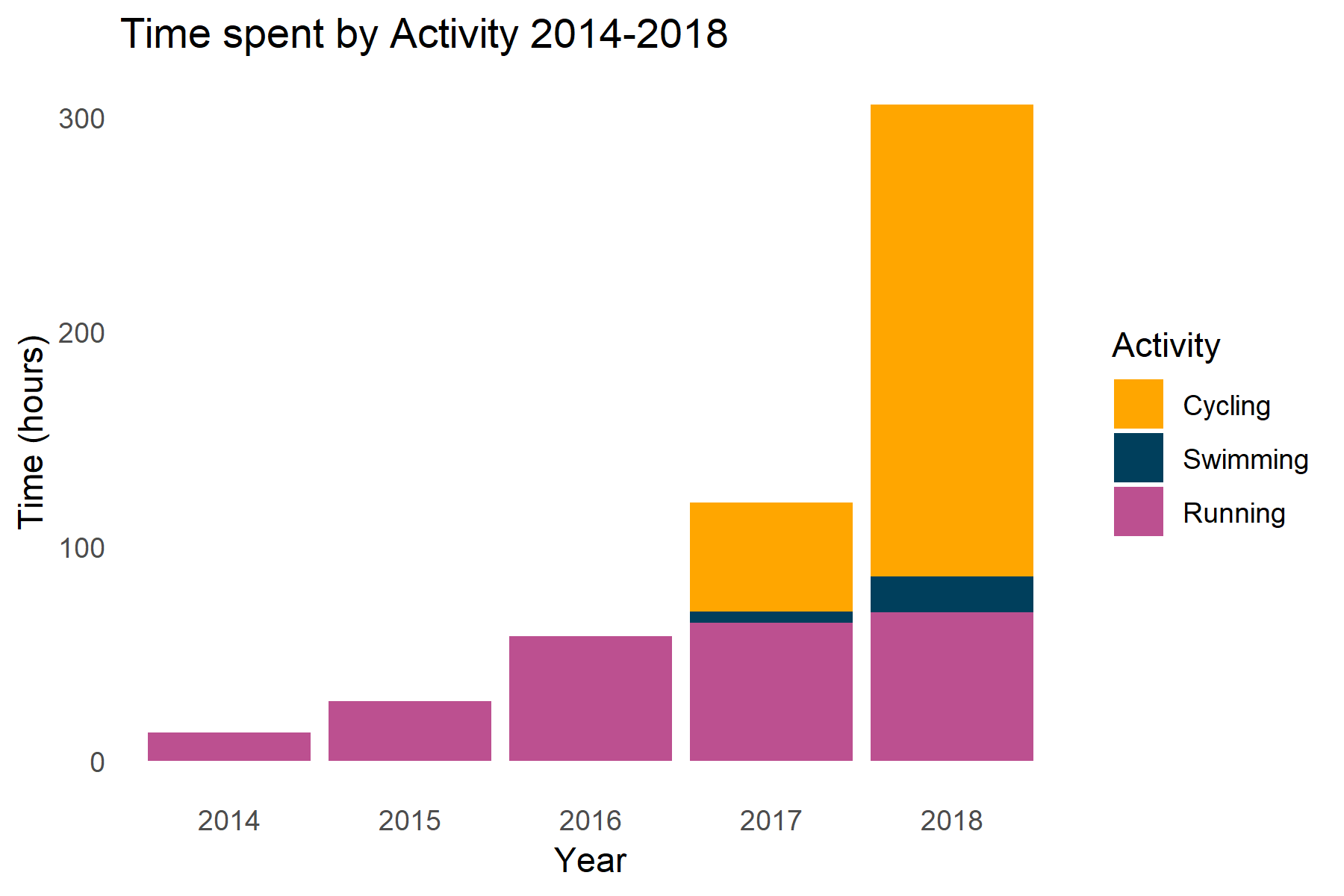
Time spent by activity for each year
I wanted to see an overview of the time spent per year on each activity (running, swimming, and cycling). To prepare the data, I filtered out the hiking and triathlon activities that were included in the dataset and combined the different types of the same activity into one category. For example, lap swimming and open water swimming both went into the swimming category.
	activity_colors <- c("#ffa600","#003f5c","#bc5090","#ff6361")
	year_colors <- c("#F0BD1D","#c7e9b4","#7fcdbb","#41b6c4","#2c7fb8","#253494","#ff6361")

	overview_data<- filter(data, Activity.Type != "hiking", Activity.Type !="multi_sport")
	#Take out hiking and triathlons
	overview_data$Activity.Type <- as.character(overview_data$Activity.Type) #Convert Activity to character
	overview_data$Activity.Type[overview_data$Activity.Type == "lap_swimming"] <- "swimming"
	#Combine all swimming activities into one category
	overview_data$Activity.Type[overview_data$Activity.Type == "open_water_swimming"] <- "swimming"
	overview_data$Activity.Type[overview_data$Activity.Type == "indoor_running"] <- "running"
	#Combine all running activities into one category
	overview_data$Activity.Type[overview_data$Activity.Type == "treadmill_running"] <- "running"
	overview_data$Activity.Type[overview_data$Activity.Type == "indoor_cycling"] <- "cycling"
	#Combine all cycling activities into one category

	overview_data$Activity.Type <- as.factor(overview_data$Activity.Type)
	# convert activity back to a factor
	overview_data$Activity.Type <- factor(overview_data$Activity.Type,levels = c("cycling","swimming","running"))
	#add levels
	overview_data <- overview_data[complete.cases(overview_data[ , 1]),]
	#Remove entries missing activity type
	overview_data <- overview_data[complete.cases(overview_data[ , 34]),] #Remove entries missing year
	overview_data <- filter(overview_data, Year != 2019) #exclude data from 2019

	#Time spent by activity per year
	ggplot(overview_data, aes(x=Year, y=Time, fill= Activity.Type))+
		  geom_bar(stat= "identity" )+
		  labs(x="Year", y = "Time (hours)", title= "Time spent by Activity 2014-2018")+ theme_bw()+
		  scale_fill_manual(name= "Activity", labels= c("Cycling","Swimming","Running"),values= activity_colors)+
		  theme(plot.background = element_blank(),
				panel.grid.minor = element_blank(),
				panel.grid.major = element_blank(),
				panel.border = element_blank(),
				panel.background = element_blank(),
				axis.ticks = element_blank()
		  )
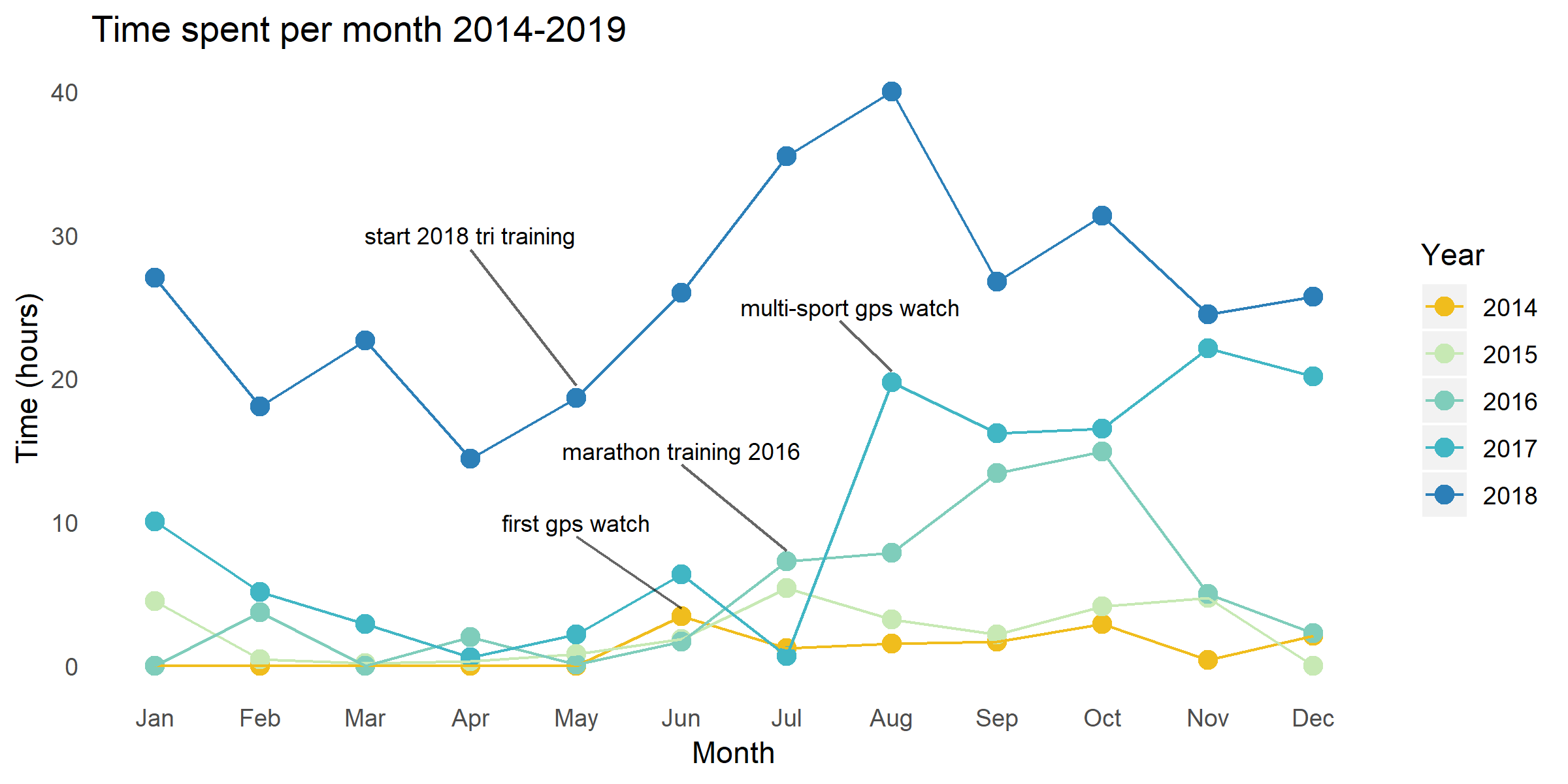
Time spent by month for each year
From the first visual it was clear that the amount of time I spent in physical activity had increased but how was this increase dispersed over the course of the year? I grouped the dataset by month and year and used summarize to get the time spent per month.
	data$Year <- as.factor(data$Year) #Create data set with time spent exercising by month
	data_all <- group_by(data, month, Year)
	data_all <- filter(data_all, Year != 2019)
	month_year_time<-summarise(data_all, Time = sum(Time,na.rm=TRUE))
	month_year_time$month <- month.abb[month_year_time$month]
	month_year_time$month <-  factor(month_year_time$month, levels = month.abb)


	# Time spent by month for each year

	ggplot(month_year_time, aes(x=month, y=Time,group= Year, color = Year))+
		  geom_point(size = 3)+ geom_line()+
		  labs(x= "Month", y= "Time (hours)", title= "Time spent per month 2014-2019")+
		  annotate(geom= "text",x= 5, y= 10, label = "first gps watch",size=3)+
		  annotate( geom= "segment", x = 5, xend = 6, y= 9, yend= 4, colour = "black",size= .5,alpha=.6)+
		  annotate(geom= "text",x= 6, y= 15, label = "marathon training 2016",size=3)+
		  annotate(geom= "text",x= 7.6, y= 25, label = "multi-sport gps watch",size=3)+
		  annotate(geom= "text",x= 4, y= 30, label = "start 2018 tri training",size=3)+
		  annotate( geom= "segment", x = 4, xend = 5, y= 29, yend= 19.5, colour = "black",size= .5,alpha=.6)+
		  annotate( geom= "segment", x = 6, xend = 7, y= 14, yend= 8, colour = "black",size= .5,alpha=.6)+
		  annotate( geom= "segment", x = 7.5, xend = 8, y= 24, yend= 20.5, colour = "black",size= .5,alpha=.6)+
		  scale_color_manual(values = year_colors)+
		  theme(plot.background = element_blank(),
				panel.grid.minor = element_blank(),
				panel.grid.major = element_blank(),
				panel.border = element_blank(),
				panel.background = element_blank(),
				axis.ticks = element_blank()
		  )
Conclusion
To further answer questions about how my training has changed over the years I created visuals specific to each activitiy type. The full code for this project is available on my github page ) . To view the full set of visuals including a break down by each activity type please visit my <a href"https://elizabetheaster.com/garmin_data_project.html">website </p> </div> </body>